-
A good design starts with a great silhouette. This makes the art more recognizable.
-
A general principle: Break down the desired object into simpler shapes — cones, spheres, and cubes.
-
Pixel art can be thought of as sculpting with color - we assemble the forms through blobs of color.
- That said sometimes it is more convenient to start with a rough 1px outline
-
Side views and fine contours are difficult to do and capture in pixel art.
- Know the level of detail permitted by your chosen level of resolution. Certain details will be lost at low resolutions and must instead be implied.
- Pixel art is not downscaling. Good pixel art requires choosing which pixels matter.
-
When drawing from a silhouette, it can get complicated due to information lost from the silhouette (i.e., an object occluding another).
- The solution is to decompose the object into simpler forms and draw the silhouettes of those forms first.
Lines and Curves
-
To achieve smooth curves:
- Vary the lengths of the segments in a continuous manner. This prevents Jaggies
- No right angles. This prevents Doubles
-
Given a straight line to span a width
and a height , we can determine how to draw it 1. - When
we want to favor drawing horizontal runs of pixels. When we favor vertical runs. - Say that the line grows is to be extended vertically, the line grows starting from the centermost pixel. In increments it goes half, third, fourth, and so on until all runs of pixels have the same length. This makes the line appear smoother since the “irregular pixels” appear at regular intervals.
- When
-
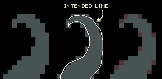
The following rules apply to curved lines.
- The curve can be approximated using tangent lines. A less curvy line will have a longer middle segment (that is just roughly a straight line) 2
- One technique to make a smooth curve is not necessarily to follow a strict 1-2-3 progression. Rather, we can do 1-2-1-2-1-3 instead. That is, simulate the smoothness by “staggering” the rows of pixels.
Shading and Coloring
- Consider shading techniques
- Flat Shading - involves stacking colors. Fewer colors = crisper object. We can texture this by varying the shadow’s edges.
- Dithering - involves creating a gradient (i.e., for diffused lighting or see through-effects). We then apply a repeating pattern on the boundary between colors.
- Consider outlines:
- Softer outlines = object looks out of focus.
- Having a border makes the object pop.
- Imperfect outlines look more natural. Achieve this by selective coloring for different parts.
- Note: Maintain contrast between the base color and the outline to make it pop out of the background.
- Color Theory would be really helpful to apply.
- No lone pixels. Colors should occur in clusters (or in dithering).
- Exception: Lone Pixels can add more detail.
Texturing
-
The following principles apply (from Sylnyrd)
-
Simplify - pixel art isn’t about being too detailed. Simplify the texture details.
-
Repetition - repeat clusters in a distributed pattern. This further simplifies the texturing work
-
Balance - make sure that the texture feels balanced
-
Contrast - vary the texture at interesting points to highlight areas. This also helps guide the audience’s eyes so that the work doesn’t feel cluttered
-
Avoid orphan pixels - the exception is if they are not obviously floating alone.
-
Use dithering
Anti-Aliasing
- Because everything is in pixels, it is impossible to draw a solid, curved block. Anti-Aliasing is a technique to smooth out curves in the line.
- It helps to think about AA as smoothing out pixels on the border that are not fully in the image.
- Essentially, AA pixels count only as “half pixels” when you zoom out
- Typically apply AA on staircases that are more than 1x1 long
- The amount of AA is proportional to the length of the step in the staircase
- Too much AA, however, makes the image too blurry.
Dithering
- Dithering is used to blend two colors together
- The greater the contrast between the colors being blended, the more dithering steps needed and the greater the resolution required.
- Whenever using dithering to give a more painterly effect and “blend” the edges of “brush strokes,” use it sparingly—otherwise the forms will be blended away entirely
Links
-
Aseprite - pixel art tool. Can be bought or built from source
-
Make Your Own Pixel Art — Create Graphics for Games, Animations, and More by Dawe and Humphries
-
Pixel Art Animation Reinvented by aarthificial - proposes a method of decoupling the animation motion from the mesh by splitting the logic into two different textures. The animation texture contains coordinate information which is used to look up the appropriate color from the mesh texture.
-
Shading - more on principles for shading in relation to art.
Footnotes
-
Using the line tool is a shortcut for this ↩
-
The less curved a line is, the better the derivative approximates it so the more the points around the line follow the 45-degree line. ↩